Collaborations: 2010 Summers End


I was honored to be apart of this cassette/digital release brought to fruition by some wonderful people, Dead as Digital, Stadiums and Shrines and The Road Goes Ever On. The concept behind Collaborations is pure and simple yet yielded some beautiful, complex and unexpected results. The participating artists range from sample based hip-hop to mellow drone rock to dream pop. For some, this was uncharted territory. Since the results could have been anything, the album art needed to visually represent the underlying concept and not a single sound. It needed to show the exchange of ideas and the complexity differing landscapes can produce while occupying the same space. On the cover, two hands share a single flowering plant, merging together and producing one. On the back, the fruits of their labor are nurtured and enjoyed.
You can read more about the project here and pre-order the cassette from wegetby here. Limited edition of 100. Hope you enjoy and stay tuned for the digital release!

TELEPHONEME: Alphabet Conspiracy Theory

TELEPHONEME is a short film done by MK12 about language working as a double-agent, carrying hidden meanings, although I think it’s mainly a way of showcasing their motion/ design capabilities, which it does effectively. The film combines live action and animation seamlessly while maintaing a retro feel that’s distinctly contemporary. Every frame is carefully constructed. They even went so far as to design a font and press kit for it which you can download on TELEPHONEME.tv. Apparently, they set out to write their own short story about an alphabet conspiracy and while doing research stumbled across the 1959 educational film “The Alphabet Conspiracy,” part of the Bell Science series, from which they borrowed the voice over. When you have a free hour I’d recommend watching the ’59 version. It’s a little girls journey through human language as guided by the opposing views of The Mad Hatter and Doctor Linguistics. It’s about as confusing/amusing as you might expect, a combination I rather enjoy.

The Sunshine Makers: Re-presented by Think or Smile featuring the music of Brandon Biondo


I’ve had “Make a music video” on my teuxdeux list for a while now, it’s been on my mental to-do list for even longer. I have sketchbooks full of elaborate ideas for short films and animations but it always seemed too daunting of a task to even start. I never could find a good place to begin. Well, there must have been some galactic alignment the other night because everything just fell perfectly into place.
While browsing archive.org I stumbled on a 1935 animated cartoon done by Van Beuren Studios for the Borden Milk Company called “The Sunshine Makers.” After watching a few seconds of it I was hooked. The animations were so beautifully glitchy and the colors were perfectly aged. Exactly the type of aesthetic I’ve been drawn to lately, and the plot was too tempting to pass up on. It’s a story about blissed out gnomes who have the power to distill sunshine and bottle it in the form of milk. (Perhaps thats where Burgess got the idea for A Clockwork Orange’s milk plus??) The gnomes get attacked by these anti-sunshine goblins which turns into an all out battle of milk vs. tar, sunshine vs. gloom.
After I downloaded the animation I scrubbed through a couple tracks I thought would effectively tell the story without words. I’ve been loving the singles from Brandon Biondo lately and “Westworld” had the perfect amount of energy, light and dark the animation needed to match what was in my head. I really wanted Com Truise’s “Sundriped” to work out but it was just a little too syrupy.
I’m really diggin’ how it all came together, I could jam to the Biondo track all day and seeing gnomes bomb goblins with milk bottles brings a smile to my face every time I watch it. Hope it brings a little sunshine your way.

The Genius of Design: BBC documentary series exploring the history of design


Back in early May BBC began airing a five part documentary series on the history of design. Luckily, for those of us outside of the UK, episodes one and two have been posted to vimeo (with hopefully the rest to come.) The Genius of Design sets out to answer the question, what makes a designer, through analysis of the world of stuff designers have created for us to live in. I’ve just had the pleasure of watching episode one, “Ghosts in the Machine” which explores the origins of industrial design as we know it today – the time when man discovered that machines could be made to produce more, faster. A time that marked the beginning of the removal of soul from objects, yet put an even greater emphasis on the need for well thought out design.
BBC, as always, does a nice job of entertaining and giving you something to think about so I’m looking forward to watching the rest of the series. I’m still digesting some of the ideas presented and highly recommend you check it out if your even remotely interested in design or are in any creative field, music, photography, research, a lot of the principles carry over and you’ll come away with a new perspective of the stuff that surrounds your life.
UPDATE: All episodes are now posted for a limited time. You can link to them all here.

Alfred Hitchcock: Movie Title Stills
This coming week marks the very first TCM classic film festival in Hollywood. I’m a big fan of the station and usually even enjoy the bumps between shows, but after checking out their festival website I was disappointed to see how corporate the design was. I feel like they could have had some more fun with a classic film festival. There’s so much history to draw inspiration from. Which is why I immediately thought of Christian Annya’s Movie Title Stills Collection. He has archived hundreds upon hundreds of movie title screens from films dating back to 1903 up through the present, and he’s continually adding to the collection. I find it so easy to get lost on the site for hours browsing type treatments as they change from decade to decade.
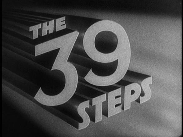
Originally I was planning on just posting a bunch of title screens that I found interesting but realized quite quickly that it would be an overwhelming amount of images. Instead, I’ll be doing a short series starting with the work of the great Alfred Hitchcock, who passed 20 years ago this month. I’ve always loved how his thrillers made you think more than they tried to blatantly scare you, which can often be even more frightening. While looking through these images I was struck by how abruptly they changed with Vertigo. Until then he mostly utilized hand lettered serifs almost to trick you into watching an innocent piece of entertainment. Then with Vertigo it seems he realized how title frames can psychologically set you up for the ride he’s about to take you on. I’d be interested to find out just how much involvement he had in the title sequence design or if he was willing to delegate something so important.
Stay tuned for the Kubrick edition…

Think or Smile | Nathaniel Whitcomb © 2010


